Typography plays a crucial role in printed marketing materials, serving as both an art form and a functional element of design. By understanding its origins, appreciating its evolution, and mastering its application, marketers and designers can create compelling materials that communicate messages effectively and leave a lasting impression. Let’s explore the history of typography, its significance in printed marketing, and how the right choices enhance readability, style, and brand recognition.
A Brief History of Typography
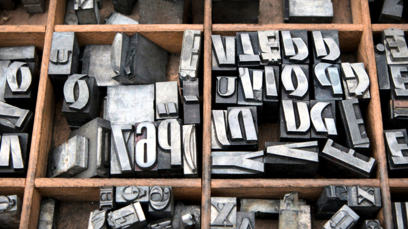
The history of typography dates back to the invention of the movable type printing press by Johannes Gutenberg in the 15th century. Gutenberg’s introduction of blackletter typefaces revolutionized the way information was disseminated. These early fonts were ornate and mimicked the handwriting of scribes, making them familiar yet functional for the time.
Over the centuries, typography evolved alongside technology and cultural shifts. In the 18th century, typefaces such as Caslon and Baskerville introduced cleaner and more legible designs. The 19th century brought about the Industrial Revolution and a demand for bold, attention-grabbing typefaces for advertising. This era saw the birth of slab serifs and the first sans-serif typefaces.
The 20th century introduced modernist ideals, leading to minimalist fonts like Helvetica, which emphasized clarity and neutrality. With the advent of digital technology, typography has become more diverse and accessible, allowing for a broader range of styles and customization options.
The Role of Typography in Marketing
In marketing, typography is more than just a design element; it’s a strategic tool. Typography can influence how a message is perceived, evoke emotions, and reinforce brand identity. Let’s explore its key roles:
1. Enhancing Readability
Typography must prioritize readability to ensure the audience can quickly grasp the message. Factors influencing readability include:
- Font Size: Adequate size ensures that text is legible even from a distance. Headlines might use larger fonts like 24-36 pt, while body text often uses 10-14 pt.
- Line Spacing (Leading): Proper spacing between lines prevents text from appearing cramped.
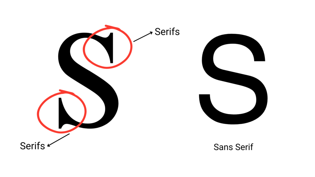
- Font Choice: Serif fonts like Times New Roman are traditionally used for printed body text due to their readability, while sans-serif fonts like Arial are favored for headings.

2. Conveying Style and Tone
Typography sets the tone for marketing materials. For instance:
- Classic and Elegant: Serif fonts like Garamond or Baskerville convey sophistication, making them ideal for luxury brands or formal invitations.

- Modern and Minimalist: Fonts like Helvetica or Futura project a clean and contemporary image, often used by tech companies.

- Playful and Fun: Handwritten or script fonts, such as Comic Sans or Brush Script, create a casual and approachable vibe, suitable for children’s products or events.

3. Building Brand Recognition
Consistent typography is integral to brand identity. Iconic examples include:
- Coca-Cola: The brand’s signature Spencerian script is instantly recognizable and reinforces its heritage and nostalgia.
- Nike: The bold, sans-serif typeface used in Nike’s marketing complements its “Just Do It” mantra, emphasizing strength and determination.
- Apple: Apple’s use of minimalist sans-serif fonts, such as San Francisco, reflects its emphasis on sleek and innovative design.
Exploring Typography Variations
Typography offers endless possibilities through variations in font, weight, style, and spacing. Here are some key considerations:
- Font Pairing: Combining complementary fonts adds visual interest. For example, pairing a bold sans-serif headline with a serif body text creates contrast and hierarchy.
- Weight and Style: Bold and italic styles can highlight important information. For instance, a bold font draws attention to promotional offers.
- Kerning and Tracking: Adjusting the spacing between letters (kerning) or across an entire word (tracking) can affect readability and aesthetics. Tight kerning suits compact designs, while loose tracking adds openness.
Examples of Typography in Printed Marketing Materials
- Brochures: Brochures often use a combination of serif and sans-serif fonts to balance readability with design. Headings might use a bold sans-serif, while body text opts for a clean serif font.
- Posters: Posters demand attention-grabbing typography. Large, bold fonts like Impact or Franklin Gothic ensure visibility from a distance.
- Business Cards: Minimalist fonts such as Lato or Open Sans lend professionalism and clarity to business cards.
Best Practices for Typography in Marketing
- Consistency: Use a limited number of fonts (typically two or three) to maintain a cohesive look.
- Hierarchy: Establish a clear hierarchy with varying font sizes and weights to guide the reader’s eye.
- Testing: Test printed materials to ensure legibility and aesthetic appeal in real-world conditions.
Typography is a powerful tool in printed marketing materials, combining functionality and creativity. By understanding its history and principles, marketers can craft designs that not only capture attention but also communicate their brand’s essence. The right typography elevates materials, making them memorable and impactful—a cornerstone of successful marketing.
Our team at OMNI Print is here to help. We offer a range of high-quality printing services and are dedicated to making your vision come to life. Contact us today to get started on your next project!
